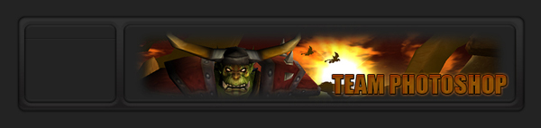
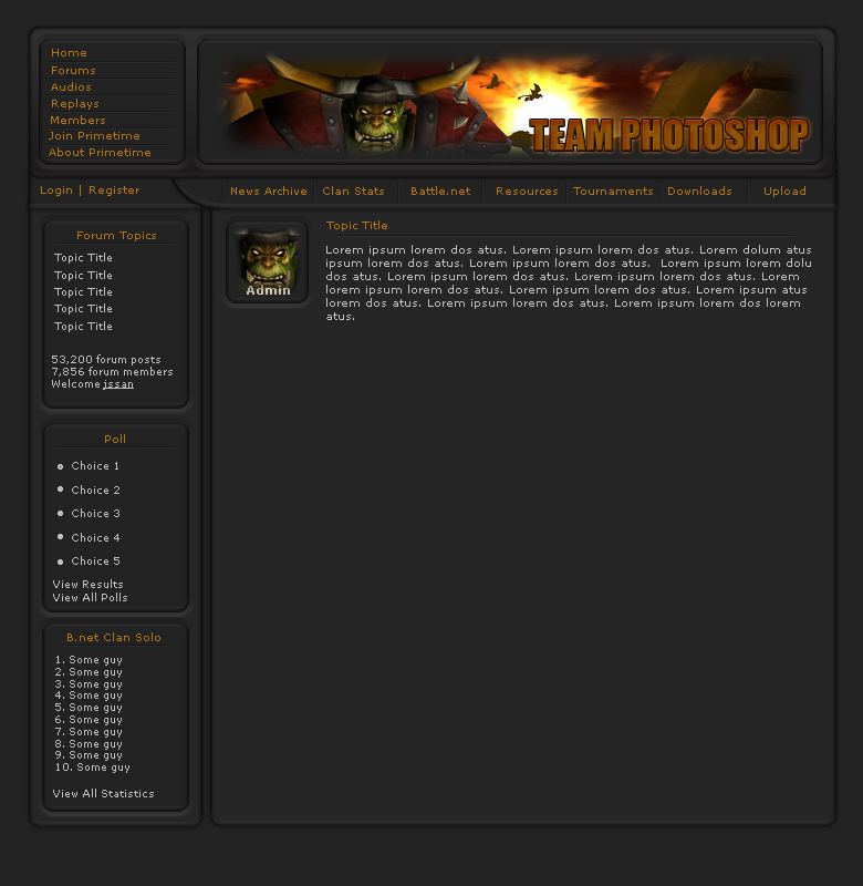
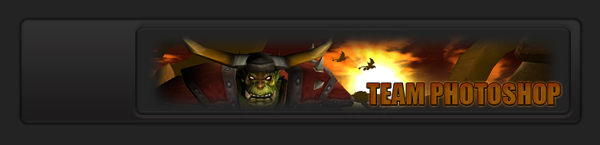
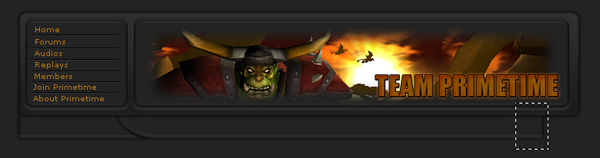
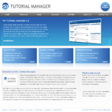
Here’s the final result:
Step 1
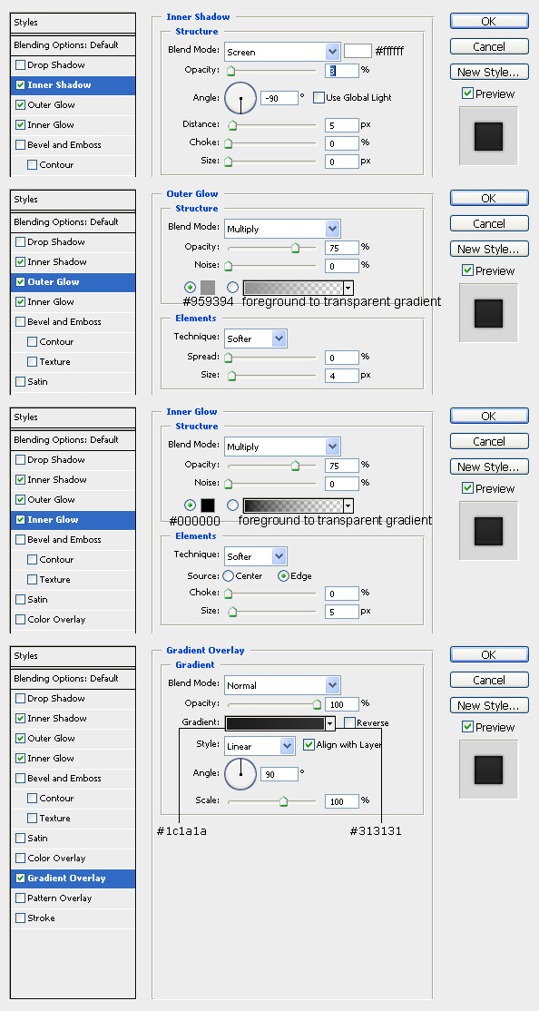
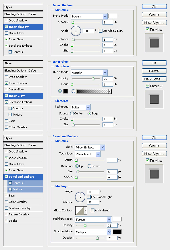
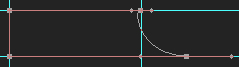
Create a new 780×800px document and give it a background color of #232323. Grab the Rounded Rectangle Tool(U) and set the radius to 10 px, and the fixed size to 730×137px. Create a new layer and name it headerbg and make your shape…this will be the background for the upper part of the site. Apply this layer style:
Step 2
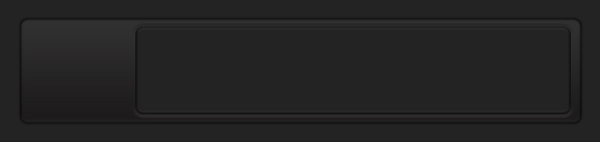
Create a new layer and name it banner and set your foreground color to #232323, then grab the rounded rectangle tool again and this time create a 566×114px rectangle. Apply the following layer style using these settings:
Step 3
Now position that rectangle inside the bannerbg rectangle, so that it looks like this:
Step 4
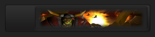
Now grab an image to use for your banner. Resize it if you need to, then stick it inside the banner. Blend it in by grabbing the Eraser Tool(E) and setting the mode to brush. Use a soft round brush and whatever size you feel appropriate…I used 100px for my image, but you may need smaller/bigger depending on your image.
Step 5
Now let’s add some text to our banner. I used impact, font size 36, color of #925806 anti-aliasing set to sharp. Apply this layer style to our text:
Step 6
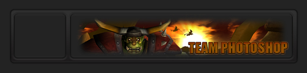
Create a new layer and name it topnav and make another rectangle using the Rounded Rectangle Tool(U), this time make it 133×114px. Give it the same layer style as the rectangle in step 2 (you can copy paste the style by right clicking on the banner layer and selecting copy layer style, then right clicking on the layer we just made(topnav) and selecting paste layer style). Position it to the left of our banner, like this:
Step 7
Now we’re going to create our actual menu. To divide the links, we’re going to use indented lines. To make the line, make a new layer and name it black. Set your foreground color to black and then grab the Pencil Tool(B) and drag across the topnav box to create a horizontal line. Now duplicate this layer and name it white. Press Ctrl+I to invert it(which will make it white), then press the down arrow on your keyboard to nudge it down one pixel by using the Move Tool(M). Time to play with the opacity and mode of both of these layers so that they blend in together. As usual, I set the mode of the white layer to overlay to help soften it. I ended up setting the opacity of the white layer to 24%, and the opacity of the black layer to 30%. After we have our line made, we’re going to soften the edges a little to help it feel more like it belongs there. But first, we need to merge the two layers together so we only have to worry about one layer. Since the white layer is set to overlay, we have to be careful about how we proceed or the color of the line changes. So before we merge, create a new layer above the white layer. Merge these two layers first, and then merge with the black layer. This way nothing changes. Before we get to softening the edges, lets make sure we’re on the same page. You should have something that looks like this:
Step 8
Now to soften the edges we’re going to use the same method that we used in step 4 to soften our banner image. Grab the Eraser Tool(E) and choose a soft round 45px brush and brush away both ends of the line, so that it fades in.
Step 9
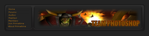
Now complete the menu by adding text and duplicating the lines to act as dividers between links.
Step 10
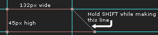
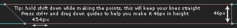
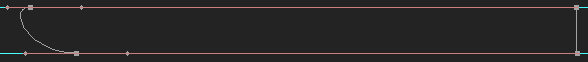
Now it’s time to make the navigation bar. If you’ve never used the pen tool before, this could get a little tricky. In the next few steps I’m going to go into pretty heavy detail about how to create this using paths. If you’ve used the pen tool before and know what you’re doing, you could just skip ahead to the final result of these steps and create it by eye. If not, read on: Create a new layer and name it leftnav, put it at the very bottom of the layer palette, only above the background layer. Grab the Pen Tool(P), make sure the mode is set to Paths, and then create a shape that looks like this. You can use guidelines(Ctrl+R) to be exact.
Step 11
Now make sure you have the path selected, then grab the Convert Point Tool(inside the pen tool palette). Drag the bottom right point inward first, then do the same for the top right point.
Step 12
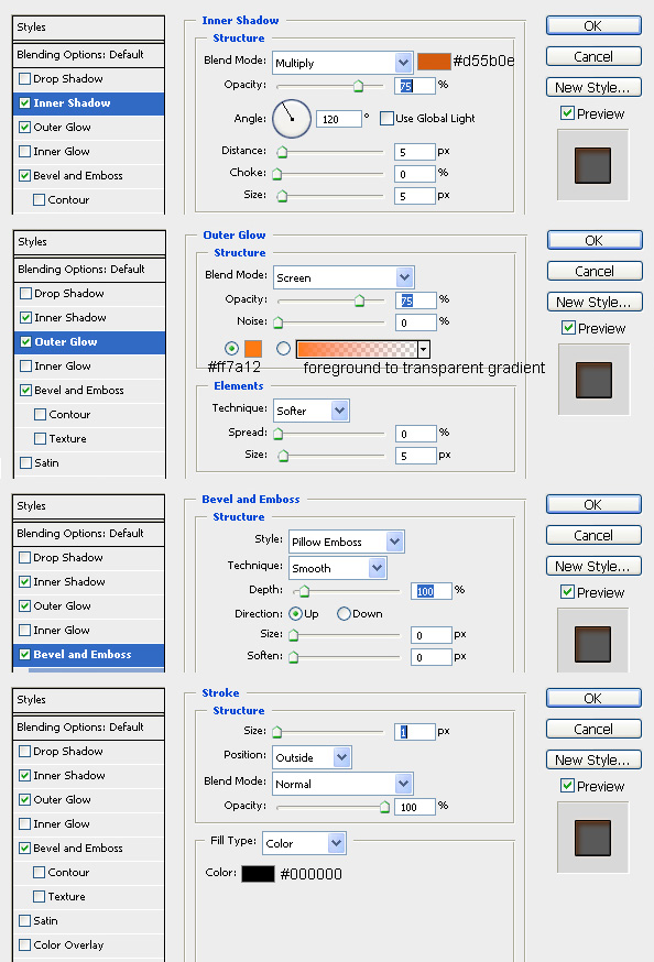
Make sure your foreground color is set to #232323, then right click on the path and select fill, choose foreground color. Then add this layer style, and position the shape so it rests directly under our header on the left:
Step 13
Make a new layer called rightnav and place it above the leftnav layer, then create another path that looks like this:
Step 14
Once again, select the path and grab the convert pen tool. Drag the bottom left point outward first, then do the same for the top left point.
Step 15
Now right click the path and fill it just like we did before. Use the same layer style as we did in step 12(copy paste it over), and let it rest to the left of the leftnav shape.
Your shape probably ended up not being long enough, so let’s fix that. Make a selection like this using the Rectangular Marquee Tool(M):
Step 16
Then press Ctrl+T to transform it. Drag the right point to fill out the empty space:
Note: I tried to explain this part with as much detail as I could, but I feel it may still be confusing. If you had trouble with this part, just download the PSD at the end of the tutorial.
Step 17
Now lets add links to our navigation bar. We’re going to do this exactly like we did in step 7…you could even use the same line, which is what I did. Duplicate the layer, rename it to your choosing, and go to Edit>Transform>Rotate CCW. Move the line into position, and trim it as you need just like we did before. Add your links, duplicate the lines, and you should get this:
Step 18
The rest of the layout can be made using the layer styles/methods that we just used. Feel free to be creative and make your own version of it here! Or you could follow my end result… Either way, here’s the PSD of the tutorial as promised to help you out!
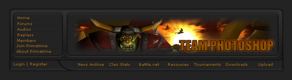
And here’s the final result:
Hope you guys enjoyed this tutorial!


6 Comments |
Add a Comment