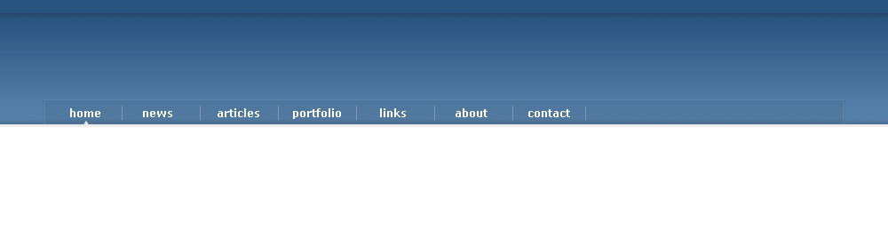
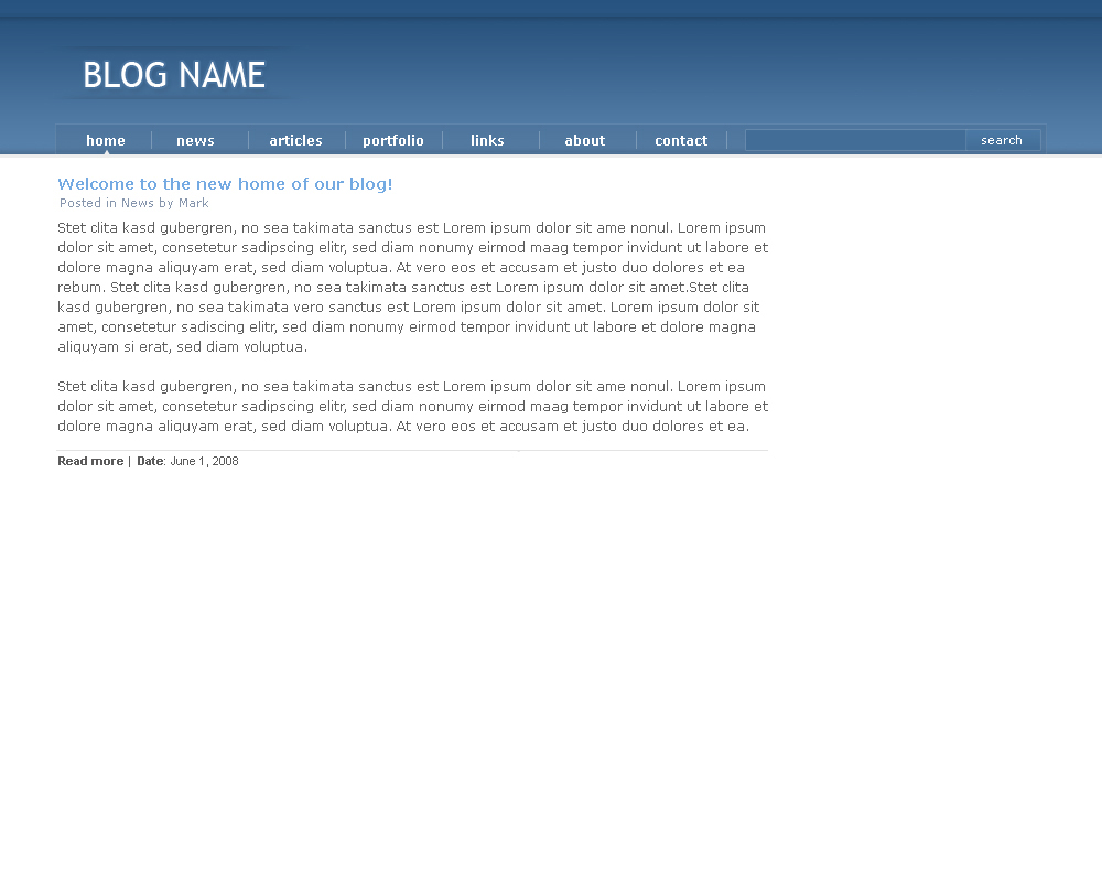
Here’s what we’re making:
Step 1
Create a new document, I made mine 1200×800px. I recommend making it this wide so you can better see whats going on outside of the layout, however if you don’t have the screen space, 1000px wide will do. For this tutorial I’ll use 1000×800px to save space for screenshots.
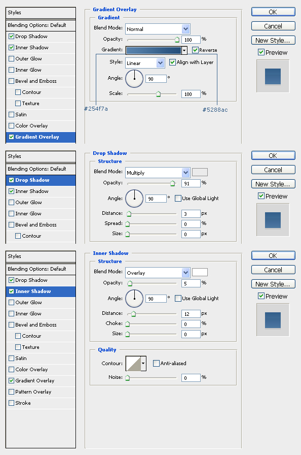
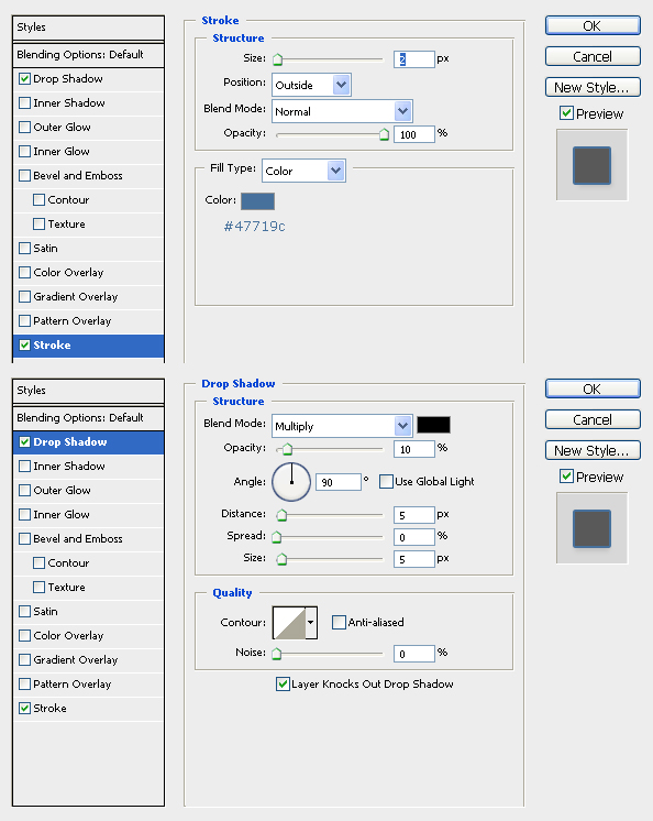
Create a new layer, and using the Rectangle Tool(U) create a new shape 1200×140px (or 1000×140px, depending on your doc size…either way it should stretch 100% of the document). Position it at the top of your document and add this layer style:
Step 2
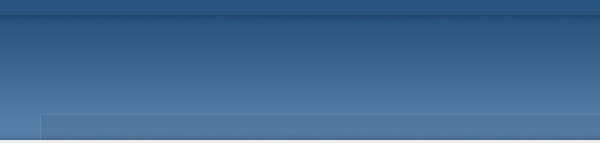
Now we’re going to combine a drop shadow with that inner shadow overlay that we added at the top of the gradient. So if you have a drop shadow already made, go ahead and grab it and drag it into our document. If you don’t have one, then head over to the drop shadow tutorial and create one (should only take a few minutes).
Once you have the drop shadow, make sure it stretches 100% across the document, if it doesn’t, press Ctrl+T to transform it. Then position it 3 pixels under the inner shadow (zooming in helps), so it looks like this:
Step 3
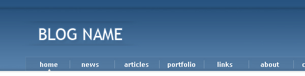
Time to work on the navigation bar. Let’s start by adding a little shading. Duplicate your drop shadow layer, then go to Edit>Transform>Flip Vertical. Now let it rest directly above the stroke that the layer style created, like so:
Step 4
Set your foreground color to black (#000000), then create a new layer and name it navbar. Using the Rectangle Tool(U) again, create a 900×27px shape. Center it, and let it rest right above the stroke. Then play with its opacity so that we get a see through effect, I ended up using 5%.
Step 5
Now set your foreground color to white (#ffffff) and create a new layer and name it navbarstroke. Grab the Pencil Tool(B) and create a stroke around the navbar layer, I strongly suggest zooming in here. Now play around with the opacity of the layer just like in step 4 to get something that blends in. I ended up going with 8%.
Step 6
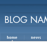
Now lets add links. I used verdana, bold, size 12, white for my links. To separate them, just create a new layer and make a white vertical line. Then play with the opacity of the layer just like we did before.
I also added a small pointer to indicate which page a user is on, you can do so if you like by creating a new layer and making a small triangle using the Custom Shape Tool(U).
I added 7 links total, and the space between the separating lines should be roughly 88px. Here’s what you should have so far:
Step 7
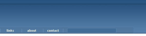
Now let’s create the search bar. Set your foreground color to #426d97 and create a new layer, name it search. Grab the Rectangle Tool(U) and create a 200×18px rectangle. Go to layer style and add a 1px white stroke, then play with its opacity. I set it to 12%. Then position it to the left of our links.
Step 8
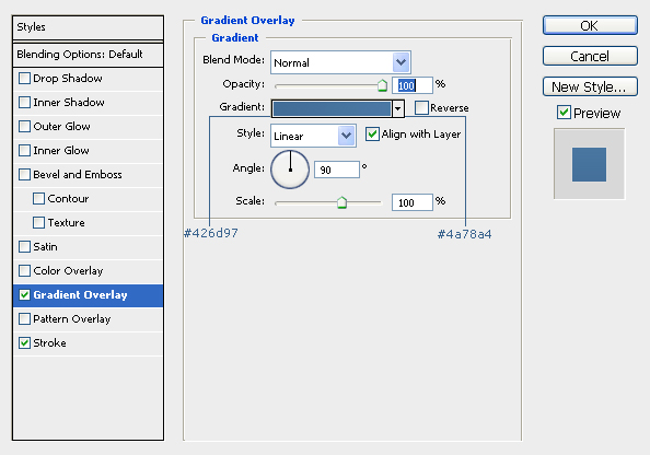
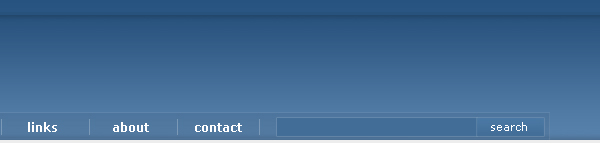
Lets add the search button. Create a new layer and using the Rectangle Tool(U) create a 67×18px shape. Move it right next to our searchbar. Give it the same stroke we gave the searchbar. Add “search text”, I used verdana, size 11, white. Now apply this gradient:
Step 9
Now it’s time to create our blog title area. Set your foreground color to white, then select Trebuchet MS as your font. Set the size to 32px and the anti-alias to sharp, then add your blog name. Then add a stroke and drop shadow:
Step 10
Lets touch the blog title up a little more. Duplicate one of your drop shadow layers, then grab the Eraser Tool(E) and set the mode to brush. With a soft round 45px brush trim the shadow down just like we did in the drop shadow tutorial and place it below the blog title. Then duplicate it and go to Edit>Transform>Flip Vertical. Now move it and place it above the text. My instructions here mig-ht be a little unclear, so refer to this image:
Step 11
Now lets create the post area of our blog. Create a new group and name it post, all new layers for the post area should go inside here. For the post title, I used Verdana, bold, size 14, # 74aae2. For the “Posted by…” under the title, I used Verdana, size 11, #8796ad. The text area should be roughly 650px wide. The font is Verdana size 12, #616161.
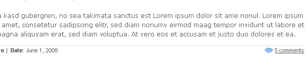
Once you have all that typed out, create a new layer and using the Pencil Tool(B) make a line to signal the end of the post, I used #e3e3e3.
Under the line, we’ll finish up the details, such as a read more link and the post date. These were made using Arial, size 11, #5c5b5b.
Step 12
Now lets create a comments icon. Set your foreground color to #76aae3 and create a new layer. Now grab the Custom Shape Tool(U) and select the shape that looks like a chat bubble. Hold shift while you make your icon to keep it proportional. Once you have it made, create a new layer and zoom in.
Set your foreground color to white (#ffffff) and grab the Pencil Tool(B). Create a few lines across the bubble part. Then play with the opacity of the layer until it blends well enough. Add comments text next to the icon, I used Arial, size 11, #5c5b5b. Underline it as well, then align everything to the far right of the post, like so:
Step 13
Duplicate the post group, then move it down:
Step 14
Now let’s create the last part of our layout, the sidebar. This area will be 200px wide. Set your foreground color to #74aae2 and create a new layer. Grab the Pencil Tool(B) and create a 200px wide line. Now grab the Type Tool(T) and create the header text, I used verdana size 14 #74aae2. We’ll use this step for the other parts of the sidebar as well.
Step 15
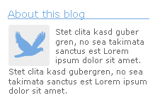
For the about part of the sidebar, I set my foreground color to #ededed and used the Rounded Rectangle Tool(U) to create my avatar background. You could put your avatar in this box. I used the Custom Shape Tool(U) and made a dove, since I didn’t have an avatar to use. I used verdana size 11 #616161 for my font.
Step 16
The other two parts of the sidebar that we’re going to make will be the Recent Posts and Archives menus. These areas will use the same header that we made in step 15. The links use the same font as the text in step 15. Now lets create a page icon for these links, here’s what we will be making:
Step 17
Now we will create the page icon. I suggest zooming all the way in to 3200% for this part so that you can see what you are doing better, this is also the resolution that the screenshots will be taken at.
Let’s get started. Set your foreground color to #bebcbc. Then grab the Pencil Tool(B) and make sure its set to 1px. Then create the outline of the page, it should look like this:
Step 18
Now lets add the corner of the page. To make it look like its pulled back, we’ll use a slightly darker shade of gray, #acabab. Now we need to draw out the corner. Add to the shape using the pencil tool so that you get this:
Step 19
If you zoom out, it’s looking pretty good now, but we can still touch it up a little with some shading. Set your foreground color to #e7e7e7. Using the pencil tool, make a line filling the bottom of the page. Then set your foreground color to a slightly lighter gray, #ebebeb. Make another line right above the first one.
Step 20
Now you can make the links for your sidebar, just place this icon next to each of them. With the sidebar being done, this is what you should have now:
Step 21
Good news, almost done! One last step. We’re going to just add a little divider between the post area and the sidebar area. Duplicate the drop shadow at the very top of our layout (the first one we made, in step 2) and rotate it by going to Edit>Tranform>Rotate 90º CW. Erase ends with the Eraser Tool(E) as we did before. Then position it so it acts as a divider. Congrats! We’re done!
Final Result
Thanks for taking this tutorial, hope you enjoyed it! Check back soon for more!


3 Comments |
Add a Comment