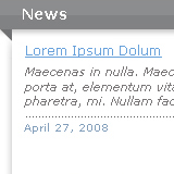
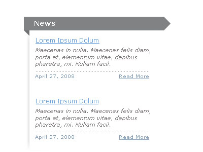
What we will be making:
Step 1
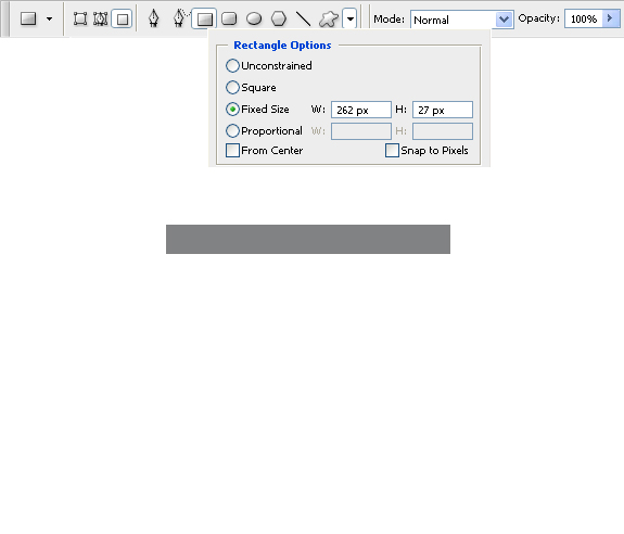
We’re going to start off by making the header to our content box. Create a new layer and name it header, then set your foreground color to #818283. Now grab the Rectangle Tool(U) and set the fixed size to 262×27px. Make sure that you set it to “fill pixels”, and then create your shape.
Step 2
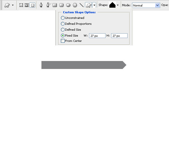
Now select the Custom Shape Tool(U)(To cycle through tools in the same palette, you can hold shift and press the hotkey for the tool. For example, hold shift and press U until it cycles to the custom shape tool) and set the fixed size to 27×27px. Create a new layer above the header layer and make your shape using the custom shape that looks like a triangle(see screenshot). Now go to Edit>Transform>Rotate 90° CW. Then move the shape so its horizontally aligned with the header, and press Ctrl+E to merge the two layers together.
Step 3
Add the title that you want to your header, I used verdana as my font, set to bold, size 14. Now lets make the corner curl, which will be a small right triangle made using the polygonal lasso tool. Make a new layer, then grab the Polygonal Lasso Tool(L), and while holding shift, drag from the bottom left corner of our header shape, making a diagonal line (zooming in helps alot here). Once you feel you feel the triangle is tall enough, drag the line straight up north back to the header, then close the triangle. Now fill the selection with color #6d6e6f. Your selection should look like this prior to filling it:

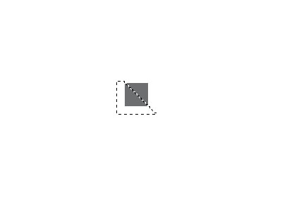
Since this step relies on knowing how you want your corner to look, it can be a little hard if its your first time making it, therefore I made a second method for making the triangle. Set your foreground color to #6d6e6f, then grab the Rectangle Tool(U), and set the fixed size to 11×11px. Make a new layer, and create your shape. Now grab the Polygonal Lasso Tool(L), and while holding shift cut the square we made in half by making a selection and then delete the lower portion of it. Your selection should look like something along the lines of this:
Note that the first method is the correct way to do this, and should be used when you use this effect. The second method is only there to help you learn how to make it, since it does take some eyeballing to make it look realistic and proportionate. Whichever method you end up following, your end result should be the same:
Step 4
Create a new layer, and before we do anything to it, apply this layer stlyle:
Step 5
Grab the Rectangle Tool(U) and make a shape that looks something like this:
Step 6
Grab the Eraser Tool(E), set the mode to brush, and use a soft round 45px brush. Erase the top, right, and bottom edges of the shape, then adjust its position using the Move Tool(V) until you have something that looks like this:
Step 7
Lets add some text to our box now. For the topic name, I used verdana size 12 with a color of #68a1db. For the post text, I used verdana size 11 italic with a color of #7b7777. For the date and read more section, I used verdana size 10 with a color of #829eba.
Step 8
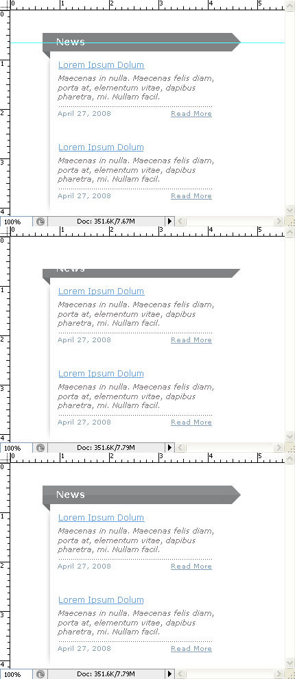
It’s looking pretty good now, but lets spice it up a little. Select your header layer, then press Ctrl+R to bring out the guide lines. Drag a guide down from the top of the document, and put it in the vertical middle of the header. Create a new layer and name it gloss, then grab the Rectangular Marquee Tool(M) and select everything above the guide line. Fill it with white, and delete the guide line. With the gloss layer selected, Ctrl+Click on the icon of your header layer in the layer palette. Right click your selection, and click Select Inverse, then press delete and deselect the selection by pressing Ctrl+D. In the layer palette, set the mode of the layer to Overlay, and set the Opacity to 9%.
Step 9
This step is completely optional. I thought the right end of the gloss looked a little weird, so I grabbed the Eraser Tool(E), and using the same settings that we used in step 6, I pressed the eraser brush once to blend in the end of the gloss.
Step 10
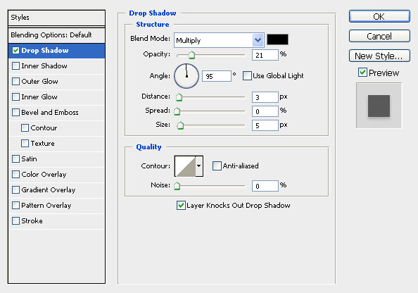
Almost done. Lets add a little shading to the bottom of our header now to add some depth. Apply this drop shadow:
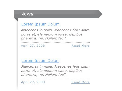
Final Result
We’re done, thanks for taking this tutorial! Also, be sure to check back tomorrow for a brand new tutorial!











4 Comments |
Add a Comment