Step 1
Start off by setting your foreground color to white and creating a new layer, name it drop shadow. Create a rectangle using the Rectangle Tool(U) (size doesn’t really matter). Now add a drop shadow:
Step 2
Set the opacity of the layer to 33%. It’s time to erase parts of the rectangle to get our drop shadow effect, but to do that we need to get rid of the layer style.
So go ahead and create a new layer under your drop shadow layer, then select the drop shadow layer and press Ctrl+E to merge them together.
Step 3
Make the following selections using the Rectangular Marquee Tool(M) and press delete:
Step 4
Another variation of the shadow is to fade away the rough edges. Grab the Eraser Tool(E), set the mode to brush, and use a soft round 100px brush to soften the edges of the shadow.
Usage
Curled Corner Tutorial
In the Curled Corner tutorial, we create a drop shadow to outline our content area. The method we use is a little different, but it shows how you can apply the drop shadow.
Product Sales Page Tutorial
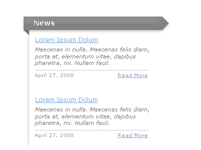
In the Product Sales Page tutorial we use the drop shadow for the background for the middle part of the layout(where the 3 blues boxes are). It adds depth to the area and helps transition from the blue gradient to the white background.
Conclusion
The drop shadow can have many uses in web design. You can use it to subtly define space (such as defining where the main content area in a design is) or you can use it to transition from one part of a design to the next, as shown above. In the header of PhotoshopandYou, it’s used to define the banner area on the sides. I’m sure there’s many more uses for it that are escaping me right now, so next time you’re designing a layout in photoshop, you might come up with a perfect use for it.


2 Comments |
Add a Comment